

You might notice that things are looking a little bit different around here. Ouster’s marketing team recently started rolling out a new brand, culminating in the launch of our all-new website today. Read on to learn about how we built a brand system to authentically represent our values and culture, as well as the technical decisions behind our new website.

Establishing who we are
The first step in this process was to align on who we are as a company, a product, and a team. We enlisted the help of the fantastic team at Elbow to guide us through this process.
To make sure we were getting input from all sides of the company, we created a focus group made up of engineers, operations, business team members, and executives to participate in the rebranding discussions. We kicked off with a series of exercises designed to articulate the identity of who Ouster is and who Ouster wants to become. We talked about how our current branding made us feel, the culture at Ouster, and the words that describe us and our product.
After articulating our identity, we considered a wide variety of visual concepts and directions, and identified the ones we thought gave off the ‘vibe’ of Ouster. These parts of the process were driven by the science of visual representation, which is especially important since our products generate such visually compelling imagery.

Sitting in to our extensive discussions and hearing us all speak passionately about the company, Elbow developed a good idea of who Ouster is and what we stand for as a culture and as a product-driven company. They went to the drawing board and came back to us with several different branding options. We reviewed the options, sat with them for two weeks, and came back to meet after our initial reactions had subsided. In this second meeting, our team was unanimous on our choice.
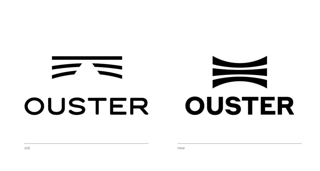
The logo
We wanted to keep the essence of the old logo but elevate it. With some updates to the shape, it made the curves feel fresher, and it more clearly delivered the sense of dimension that we sought with the old logo. A sharper, custom logotype balances the fluidity of the logomark. For versatility, we wanted the text and logo to work together and also be capable of standing independently. This meant simplifying the slightly complex graphical design of our prior logo, and bringing out the text with a bolder, more angular typeface.

Our colors
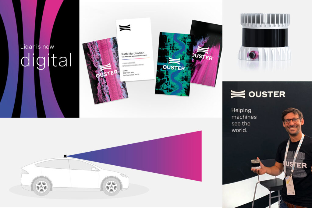
Our colors are primarily black and white to help us communicate clearly, but we also wanted to inject color to add versatility to the brand system. Our new colors and gradient scales inject personality and allow us to draw attention where needed. And from a symbolic perspective, the colors allow us to carry the essence of the colorful point clouds that our sensors create.

Website rebuild
The redesign of our website was a key part of our overall rebranding, and as part of the process we rebuilt our web infrastructure from the ground up to meet our needs for the coming years. The process started with defining our website’s site map and working on the user experience. New wireframes were established for each page that incorporated the new copy written by the marketing team and implemented a responsive-friendly 12 column grid. Next we used Figma to skin the wireframes and collect feedback on the designs.

We had a few basic technical requirements for the re-engineered website.
- Serve lots of content, namely large-scale, high-resolution images: fast loading/responsiveness despite the heavy file sizes
- Experience has to be great on all devices everywhere: good UX on desktop browsers connected to high-speed internet to mobile devices on 3G
- Control of the site content, page layout, and website management: control of content, layouts and deployment sits with marketing team instead of engineering
- Share technology (React components) with the tooling and services in Ouster Engineering: content for the public site enhanced by integrating tools we use internally. Things on our mind are: an integrated web-based visualizer and blog posts that call out sections of a lidar scene or move through time as the page scrolls
- Integration with Hubspot, and other marketing tools: full visibility into track the customer lifecycle

Based on the requirements from the team, we identified Gatsby as a blazing fast static site generator that allows the reuse of existing internal React components and is well-connected with various CMS platforms. Gatsby and GraphQL let the team include content from the marketing and recruiting teams in an entirely native way.
The development team built a framework around the pages and blocks from the design to give the creative team native control over as many aspects of the site as possible. This results in a site with fast loading, degrades the user experience gracefully in poor network conditions and gives the internal team here the freedom to own the experience of the user.
We are going to keep growing our web presence with even more documentation and resources for our customers to download, so keep an eye out for new material coming soon!

The rest of the Ouster universe
A rebranding is so much more than just updating a logo and colors. We hired our first in-house designer, and over the past several months we’ve implemented the brand in all of our internal and external-facing communication and assets. This included everything from updating our instruction manuals, packaging, internal documentation, customer presentations, event collateral, and of course, as you’re reading right now, our website. We hired an amazing photographer who helped us with multiple photo shoots, including new headshots for everyone at Ouster and some great shots of the OS1 and OS2 sensors.
We are very excited that our new brand now better represents who we are as a company and where we’re heading in the future.
Related Articles

Built to last: Why Ouster BlueCity is a rugged and reliable choice for ITS deployments
Defining a New Era of Durability in ITS
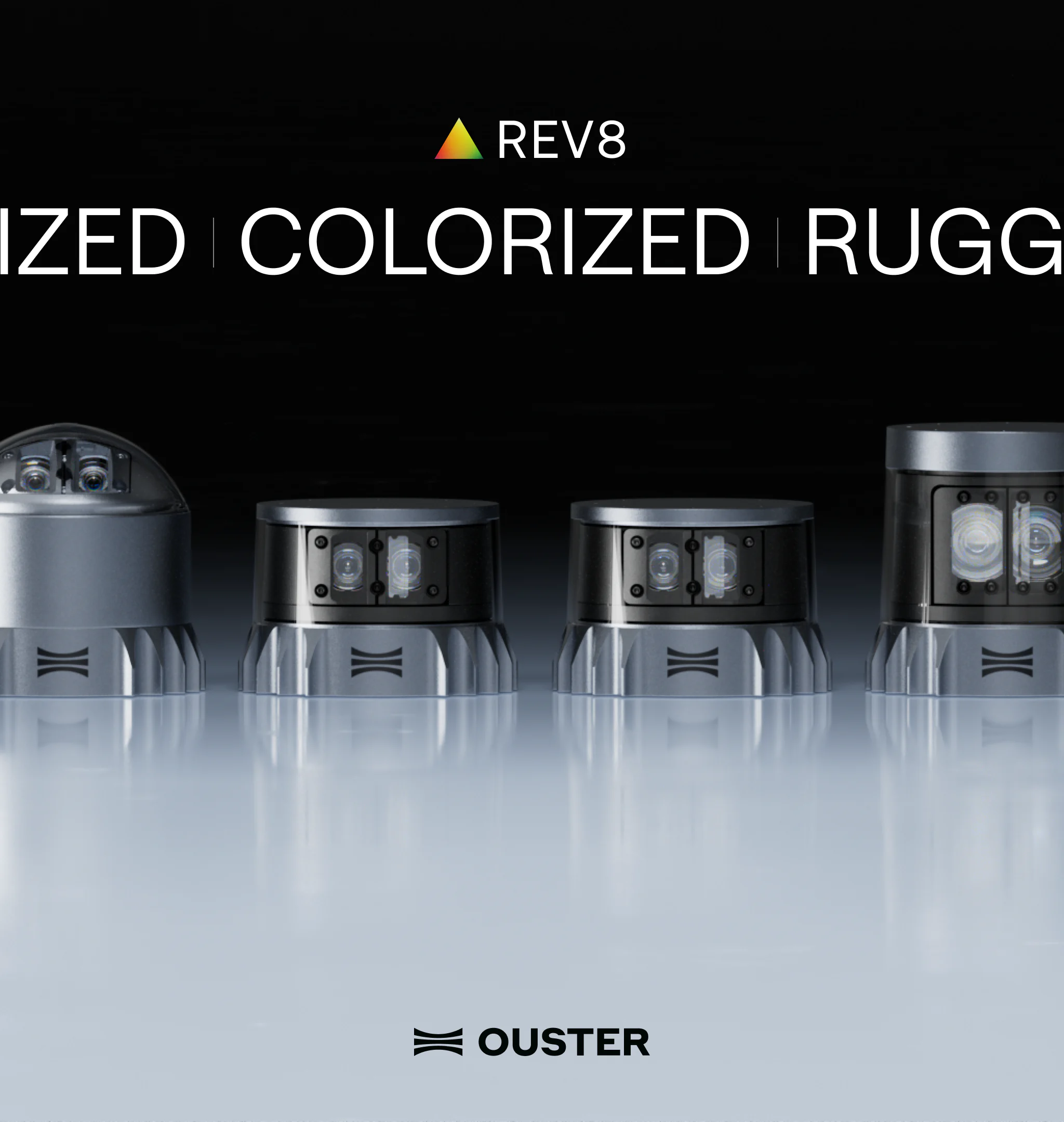
Introducing the REV8 OS Family: The World’s First Native Color Lidar
A new generation of Ouster digital lidar, powered by custom L4 Ouster Silicon. Rev8 introduces native color lidar, provides up to double the range and resolution, and is designed for functional safety, reliability, affordability, and scale.
Freie Universität: High-Precision, Small-Footprint Mapping
Researchers at Freie Universität Berlin are changing a storage paradigm for autonomous navigation. By using Ouster OS2 digital lidar to create ultra-lightweight bird's-eye-view maps, the team achieved sub-50cm localization accuracy with a map footprint of just 4 MB per square kilometer.